Making complexity manageable
Center for Southeast Asian Studies
University of Michigan, Ann Arbor
The staff of the Center for Southeast Asian Studies were quite clear on what their message was: to encourage the study of their region and its languages at UM. What they wanted was a web site which did this more effectively.
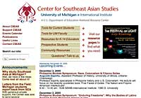 In our work with the Center, it became clear that they had a tremendous amount of information to share with the university community, but making it available in a usable way was a substantial task. In addition to making use of some important web technologies, we also took a close look at how the site was organized and presented. Working within the bounds of the existing graphical design, we clarified and unified page templates to give the entire site a common visual organization.
 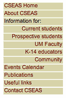 More information, and attention-grabbing links, were placed on the home page so that visitors could see at a glance the wide range of activities supported by the Center.
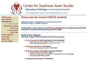
Perhaps most importantly, we shifted the primary organization of the site from one that reflected the Center's administrative structure to one which focused on the needs of their visitors. Special "resource pages" were constructed, one each for the Center's core constituencies. Information and links useful for prospective graduate students, for instance, was collected in one place and organized in a way that is meaningful to them. Information for faculty, to take another example, is organized and presented differently - though some of the items overlap. The Center's site logs demonstrated that these new resource pages quickly became some of the most popular pages on the site.